Aarogya Setu Redesign
Service redesign of Covid-19 app (2022)
OVERVIEW
Summary
Aarogya Setu was Govt of India initiative developed in a public-private collab by the National Informatics Centre team.
The app is designed to complement the efforts of the Department of Health by alerting app users about risks, best practices, relevant advisories, and vaccine related information related to COVID-19 containment.
Through this case study, we tried to find gaps in the user experience and ideate possible improvements.
Tools
Figma, Miro, Forms
& Procreate
Role
UX designer
team of 3
Client
Academic project
Srishti Manipal
Timeline
Jan'22
(4 weeks)
CONTEXT
Motive
While traveling from Bengaluru to Mumbai, we encountered a mandatory requirement for flying: "All passengers must install the Aarogya Setu app."
The app was designed for active use by everyone, yet in reality, many installed it only to meet the mandate and never engaged with it afterward.
This case study explores the root causes behind this lack of sustained usage and presents potential solutions to enhance user engagement and long-term adoption.

PROCESS
We followed the Double Diamond framework to structure our approach, ensuring a balance between divergent exploration and convergent problem-solving. The first diamond helped us discover user behaviors and define key challenges through research, while the second diamond allowed us to develop potential solutions and deliver actionable recommendations. This systematic approach ensured that our insights were both user-centered and strategically grounded.
SECONDARY RESEARCH
Timeline
Understanding an app’s journey over time provides valuable context about its evolution, policy changes, and user sentiment shifts. By plotting the timeline of Aarogya Setu’s history, we identified key events that influenced adoption and engagement. This might help us pinpoint when and why users disengage.

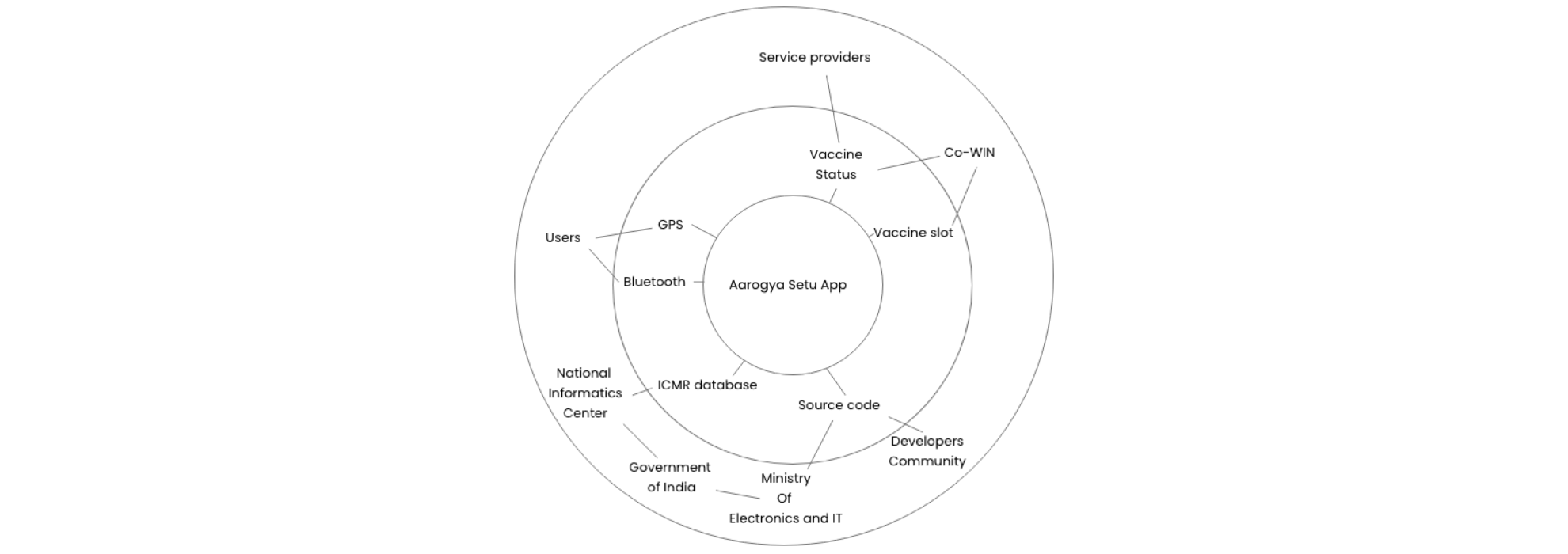
Ecosystem
Aarogya Setu didn’t exist in isolation—it was part of a broader health, technology, and governance ecosystem. Mapping this ecosystem helped us analyze external influences. This provided a holistic view of the factors impacting adoption and sustained usage.
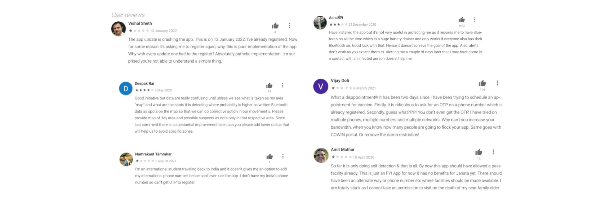
User Reviews
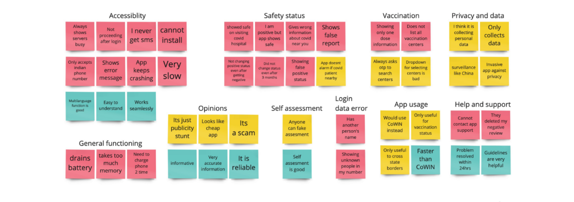
User reviews provide direct insights into public perception, pain points, and expectations. By analyzing feedback, we identified recurring themes related to usability, functionality, and overall user experience. This helped us understand key friction points and areas where the app failed to meet user needs, guiding our recommendations for improvement.
Expert Reviews
Aarogya Setu has been under constant criticism with respect to user privacy and security.
The app uses user's GPS and bluetooth data to trace contact and alert about possible covid-19 exposure.
We read a lot of expert opinions about the app. Most of whom gave a negative feedback and pointed out flaws in the
tracing method. From user reviews, we were able to confirm the inefficiency in contact tracing.
Due to all these reason, we made a collective decision to drop the contact-tracing feature of the app.
PRIMARY RESEARCH
Survey
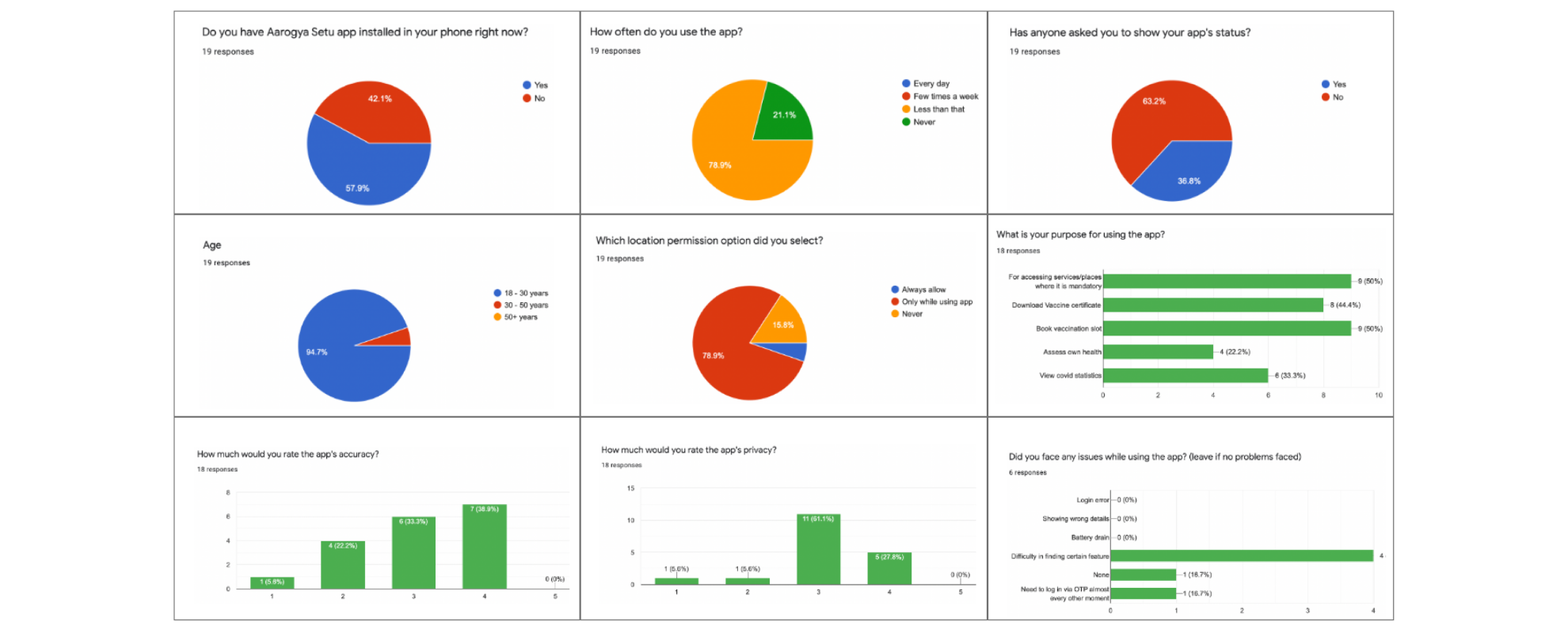
We conducted a short survey and gathered responses to validate user reviews and gain deeper insights into user concerns.
This helped us determine whether common complaints were recurring patterns or one-off issues.
The survey also provided context behind user frustrations, helping us refine our analysis.
Interview
After the survey, we interviewed 10 people for 20 minutes each regarding their experience with Aarogya Setu.
The insights we gathered were largely consistent with the themes found in Play Store reviews,
reinforcing our earlier findings. However, the interviews also offered additional context and nuances,
helping us better understand user pain points and motivations.
Key findings:

DEFINING
Personas & Journey map
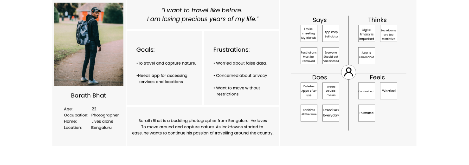
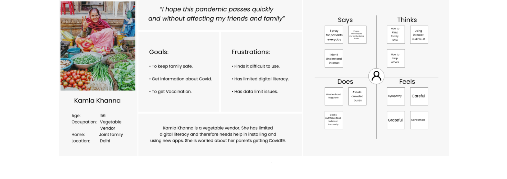
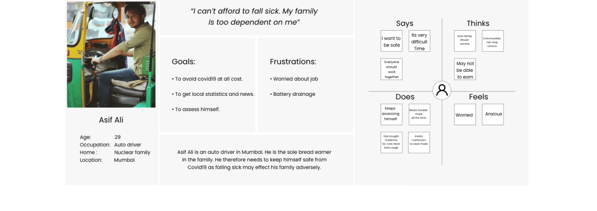
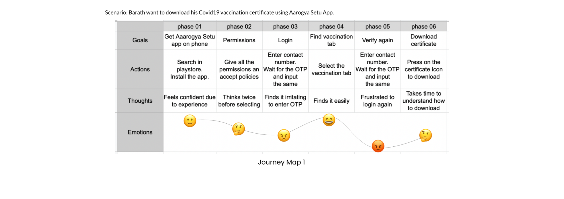
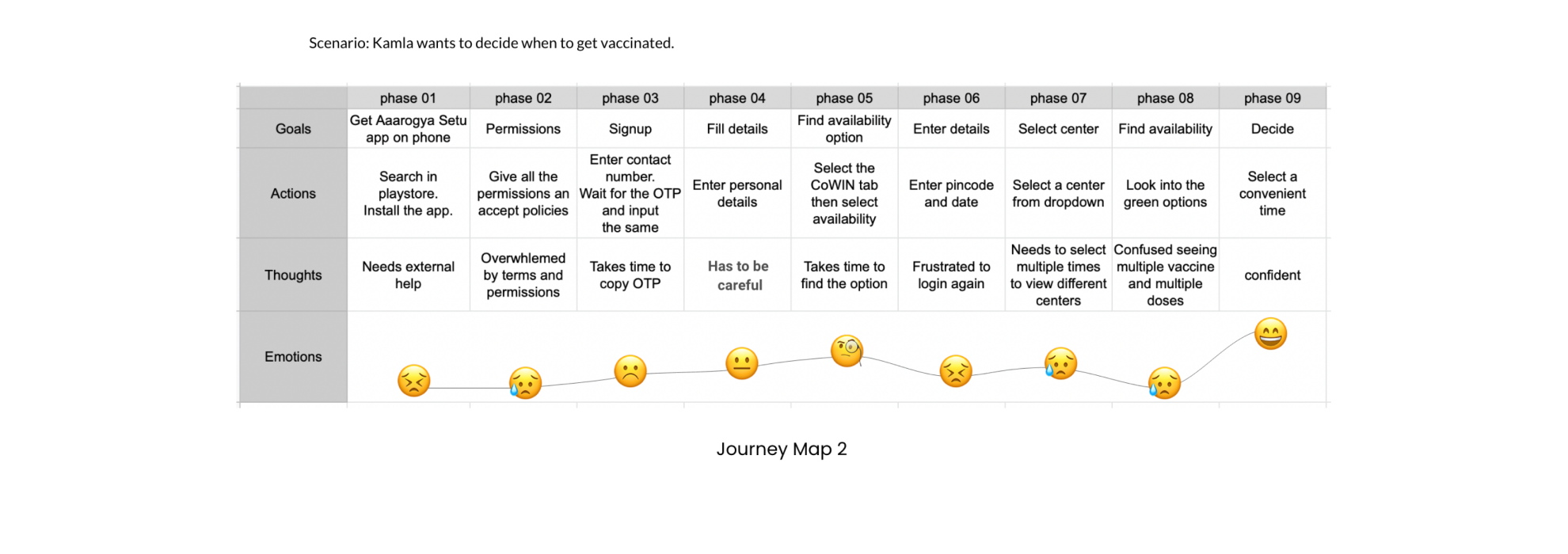
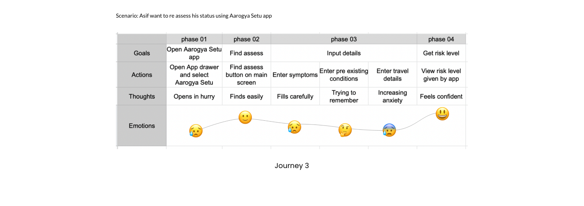
We created 3 different personas with different personality archetypes and created empathy maps for them. We imagined few scenarios and plotted a journey map for these personas.
HMW questions
Once we were done with the primary research, we narrowed down the problem statement to 3 HMW questions:

DESIGN
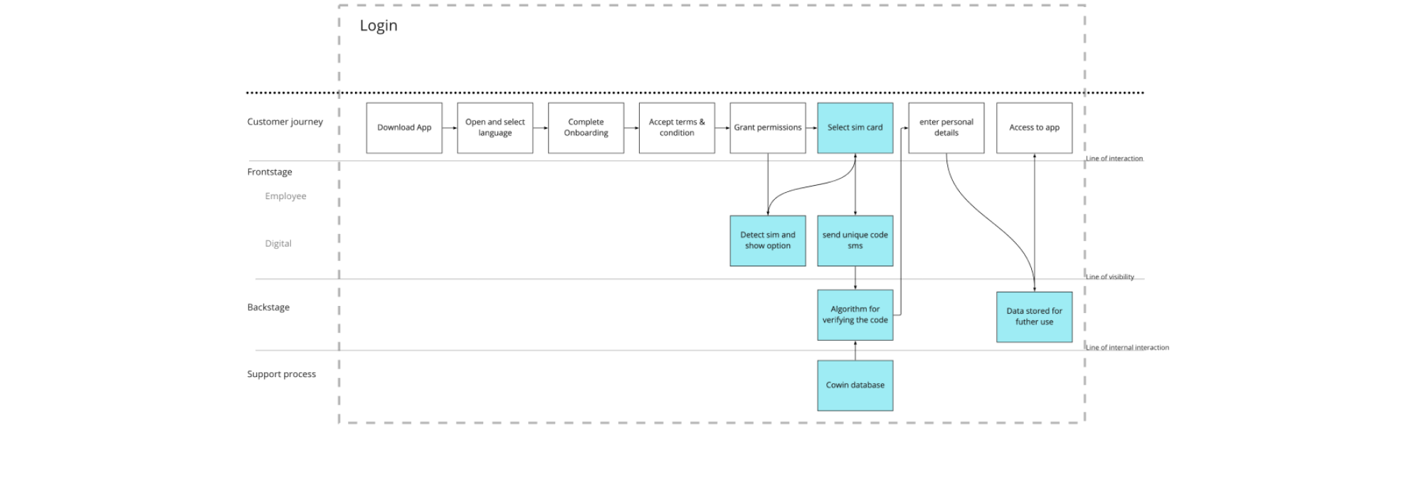
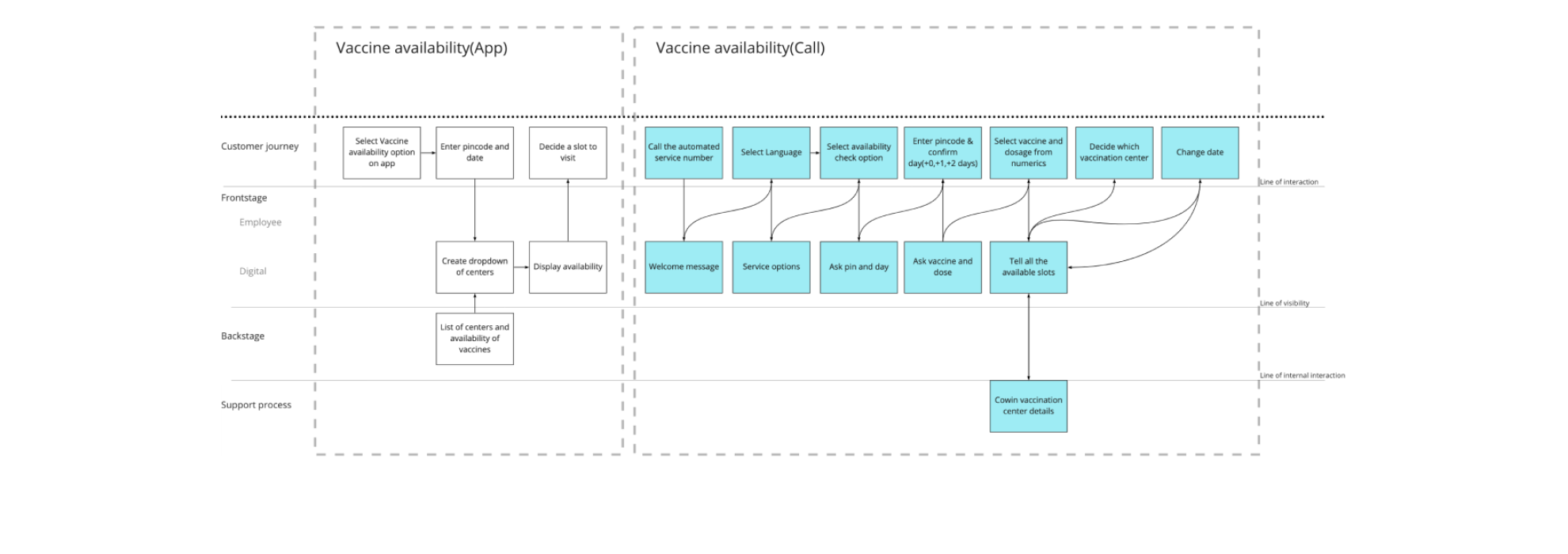
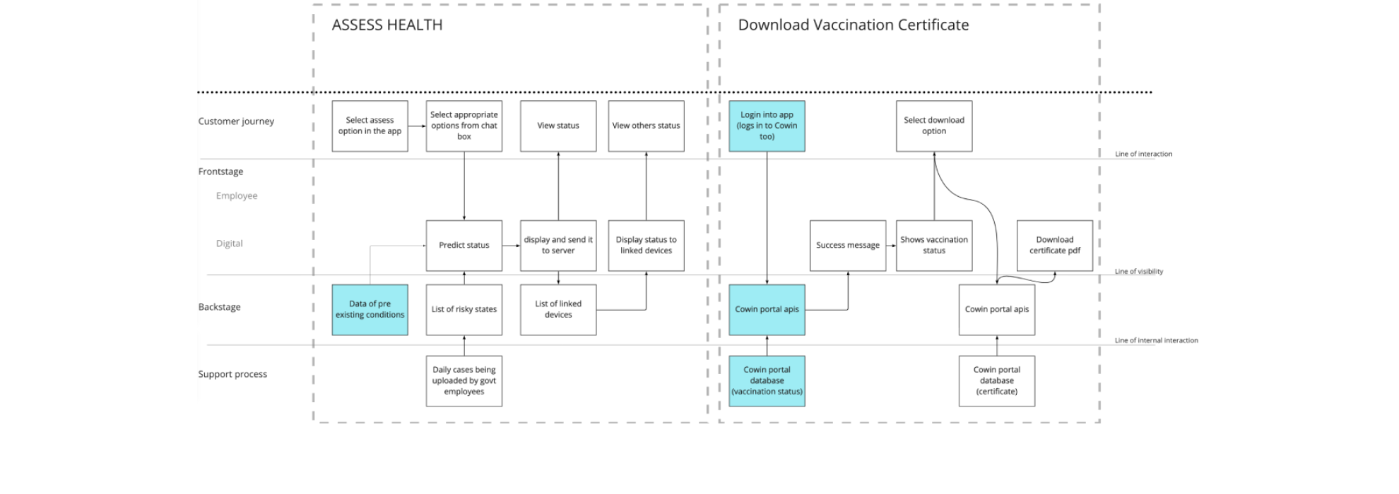
Service Blueprint
We did a short ideation session and came up with lot of ideas. We tried implementing those through new service blueprints.
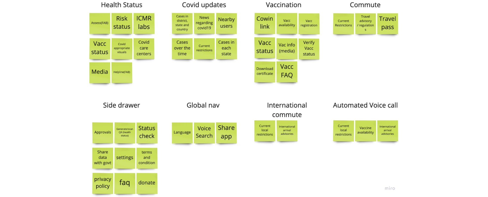
Information Architecture
We broke down current IA into cards then added the cards with noval features that we came up with in ideation phase.
Then clustered them into groups to create a new IA.
Mockup
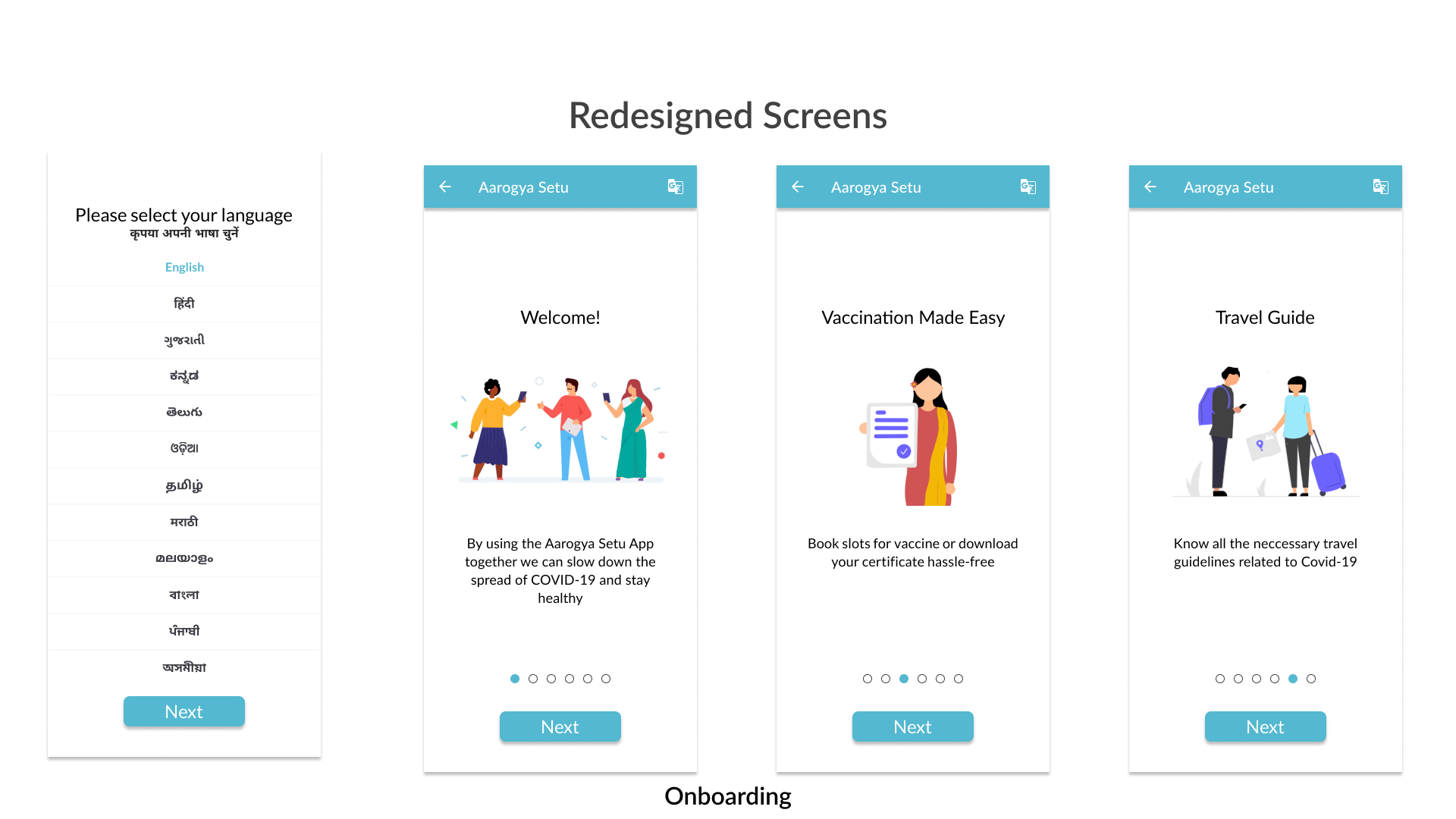
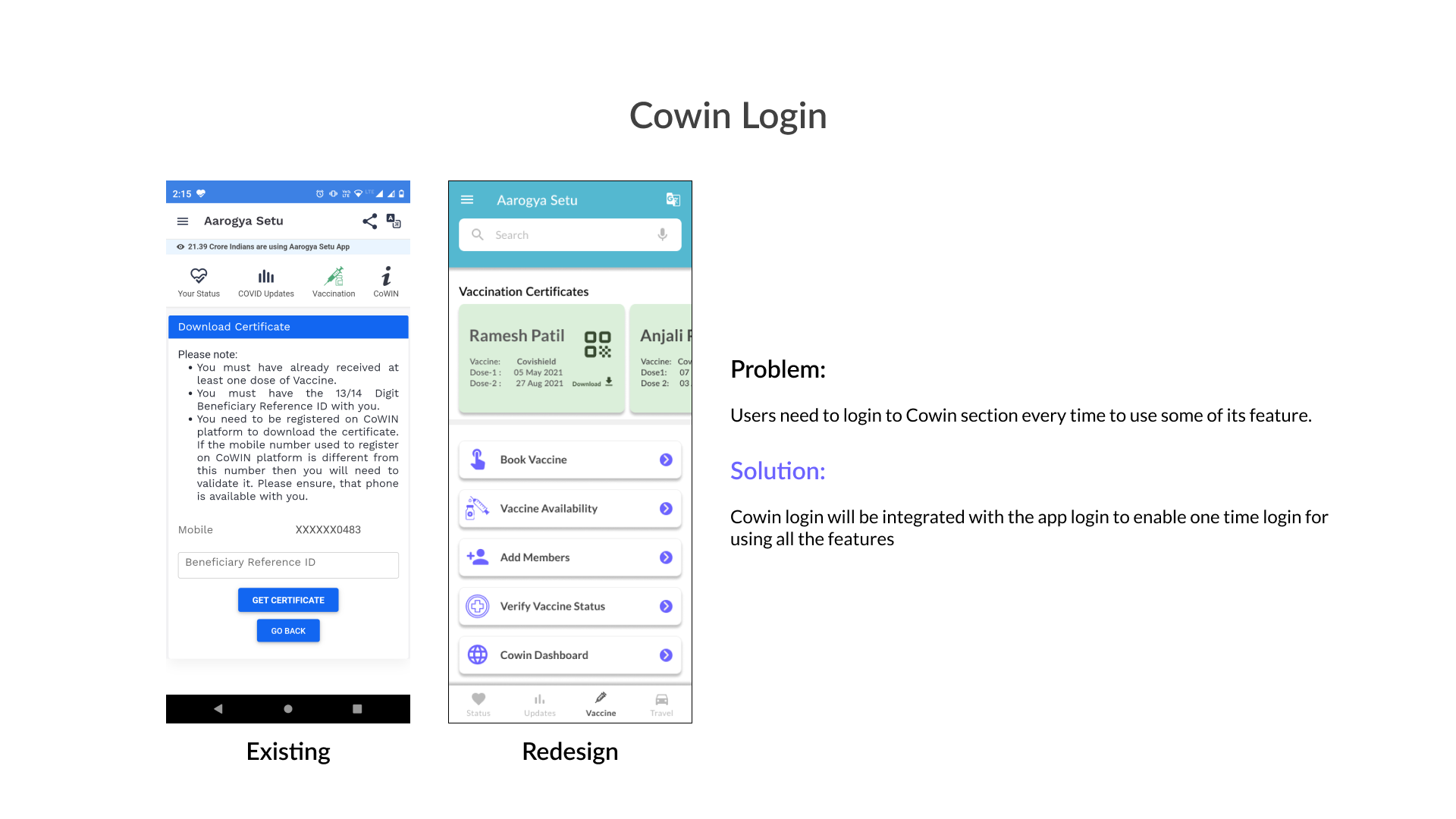
We created Lofi wireframes, iterated few times then finalised the mockups.
Solutions
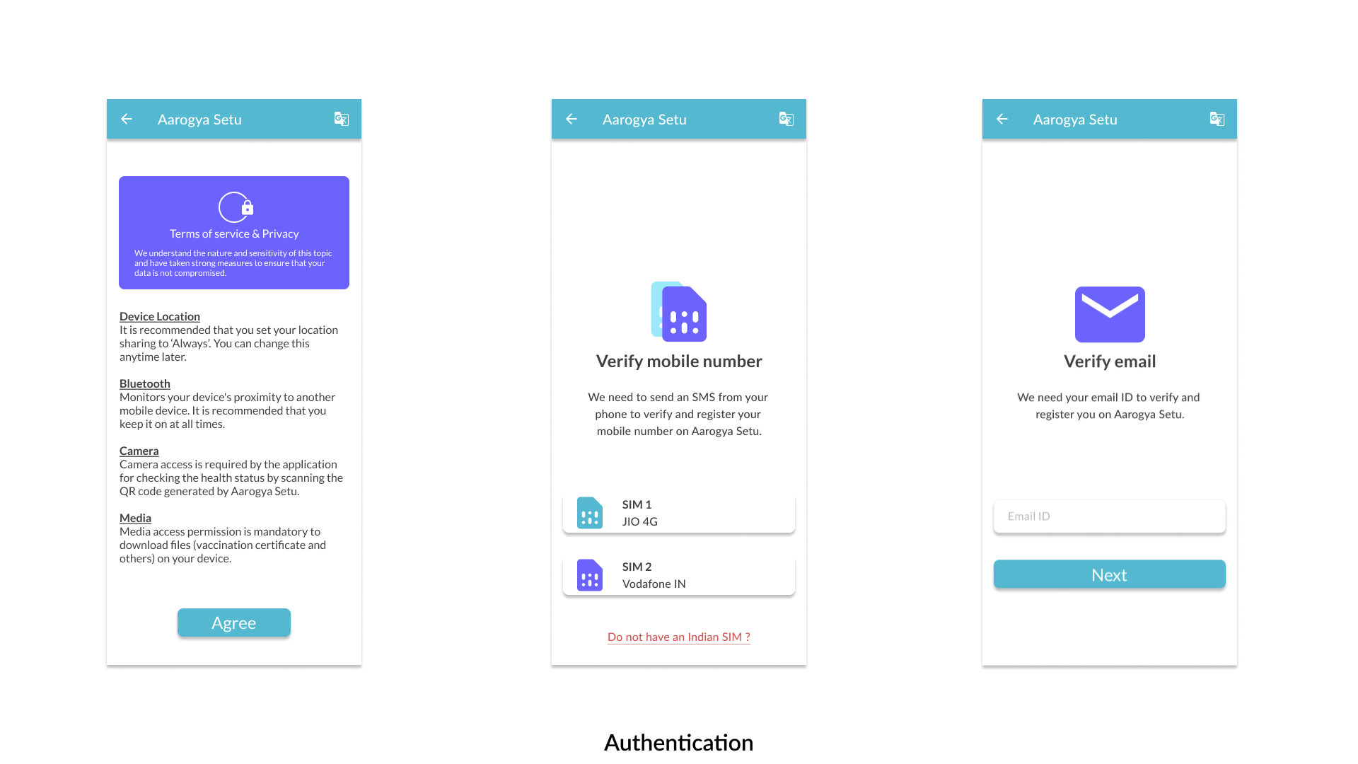
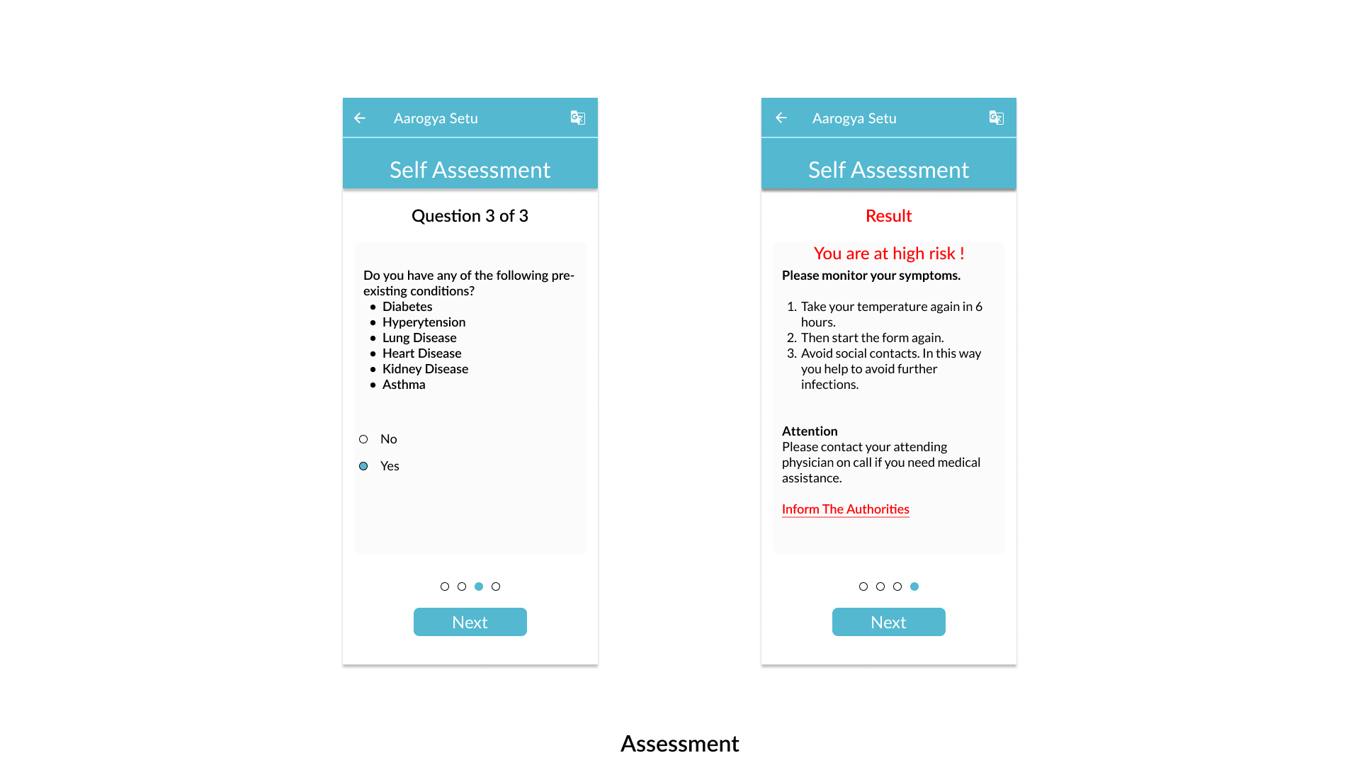
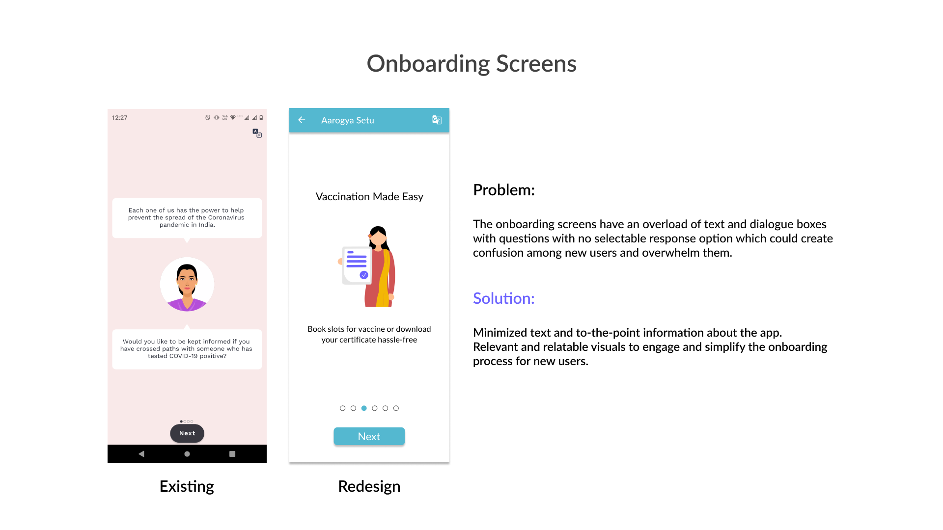
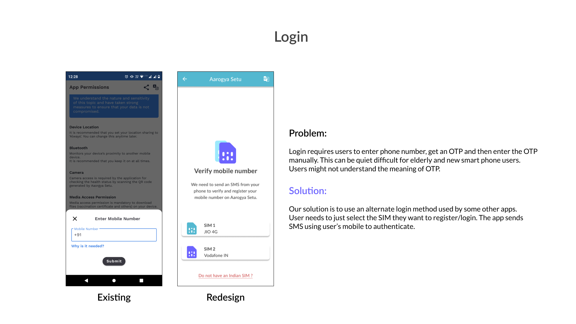
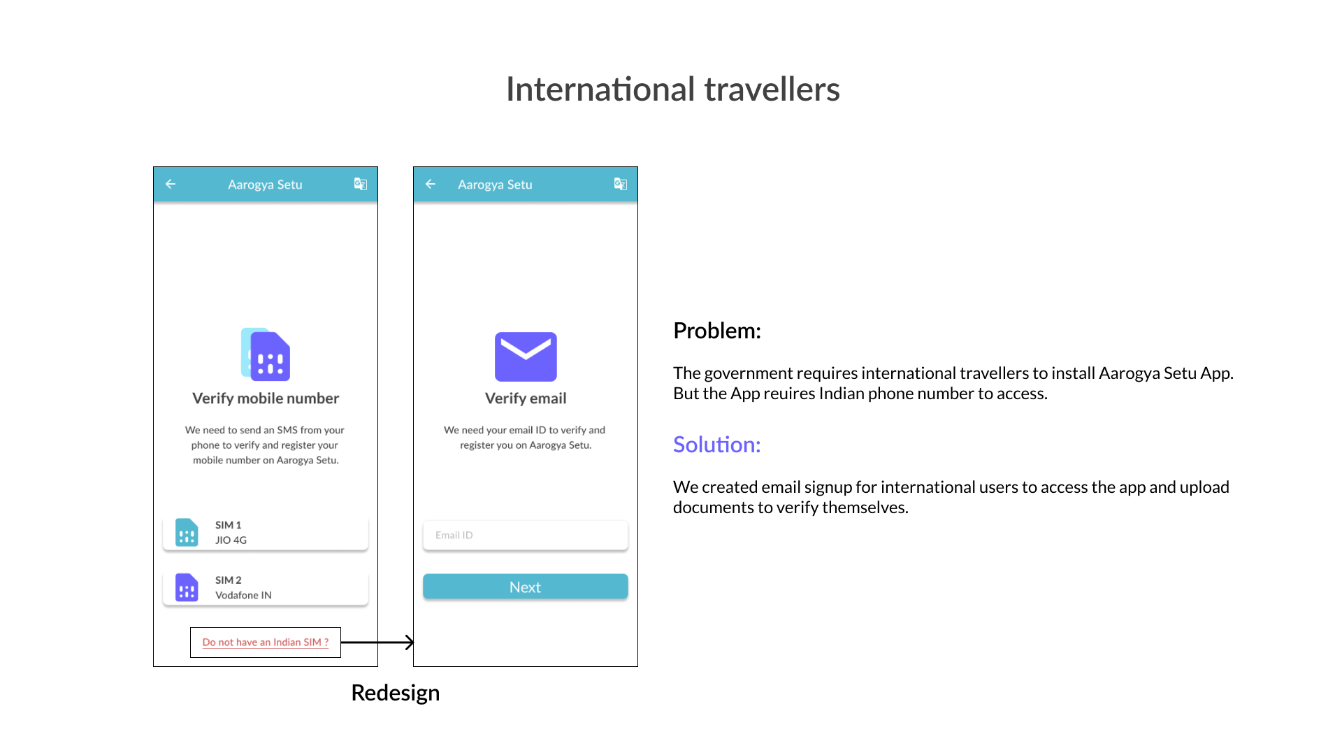
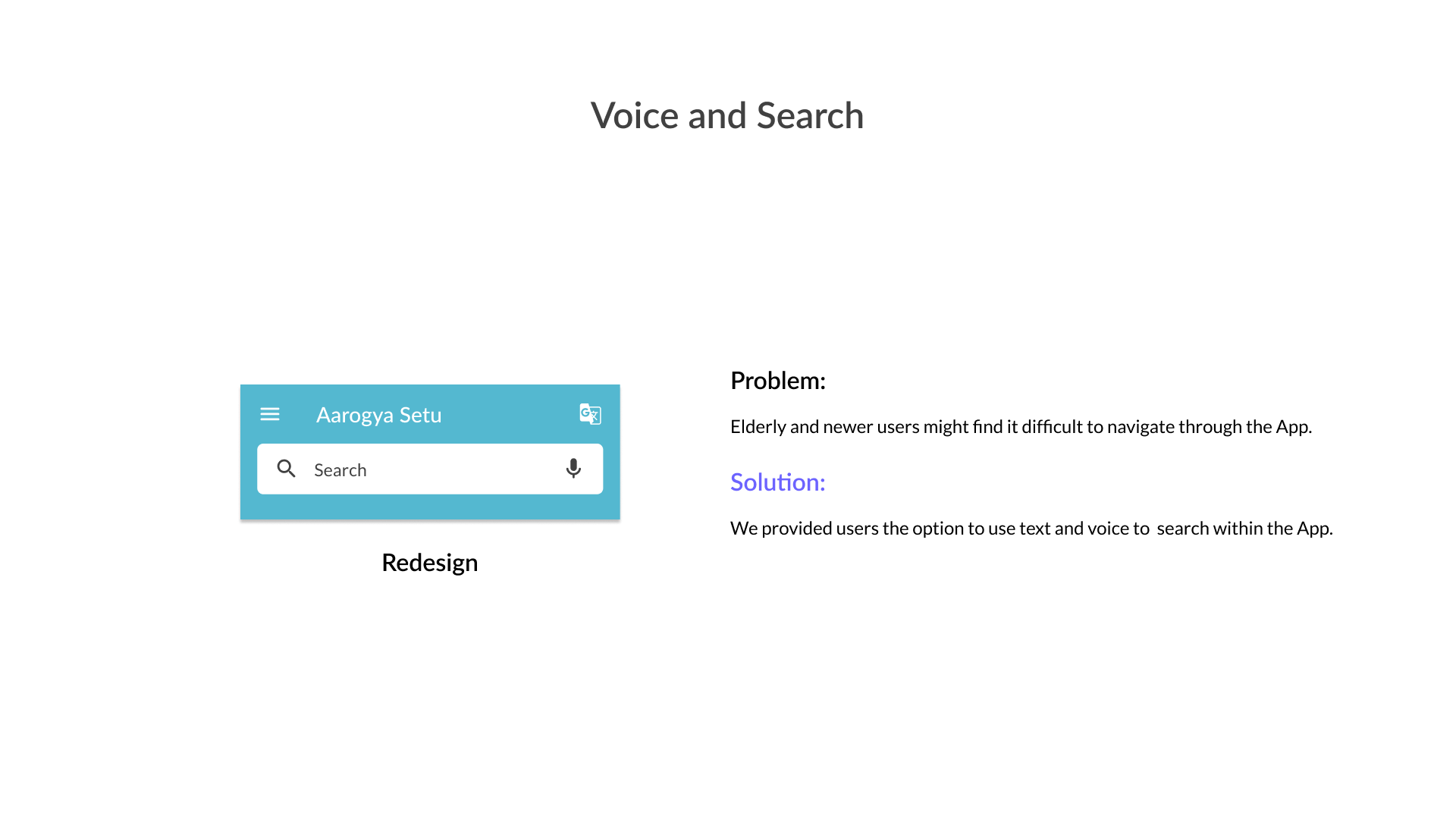
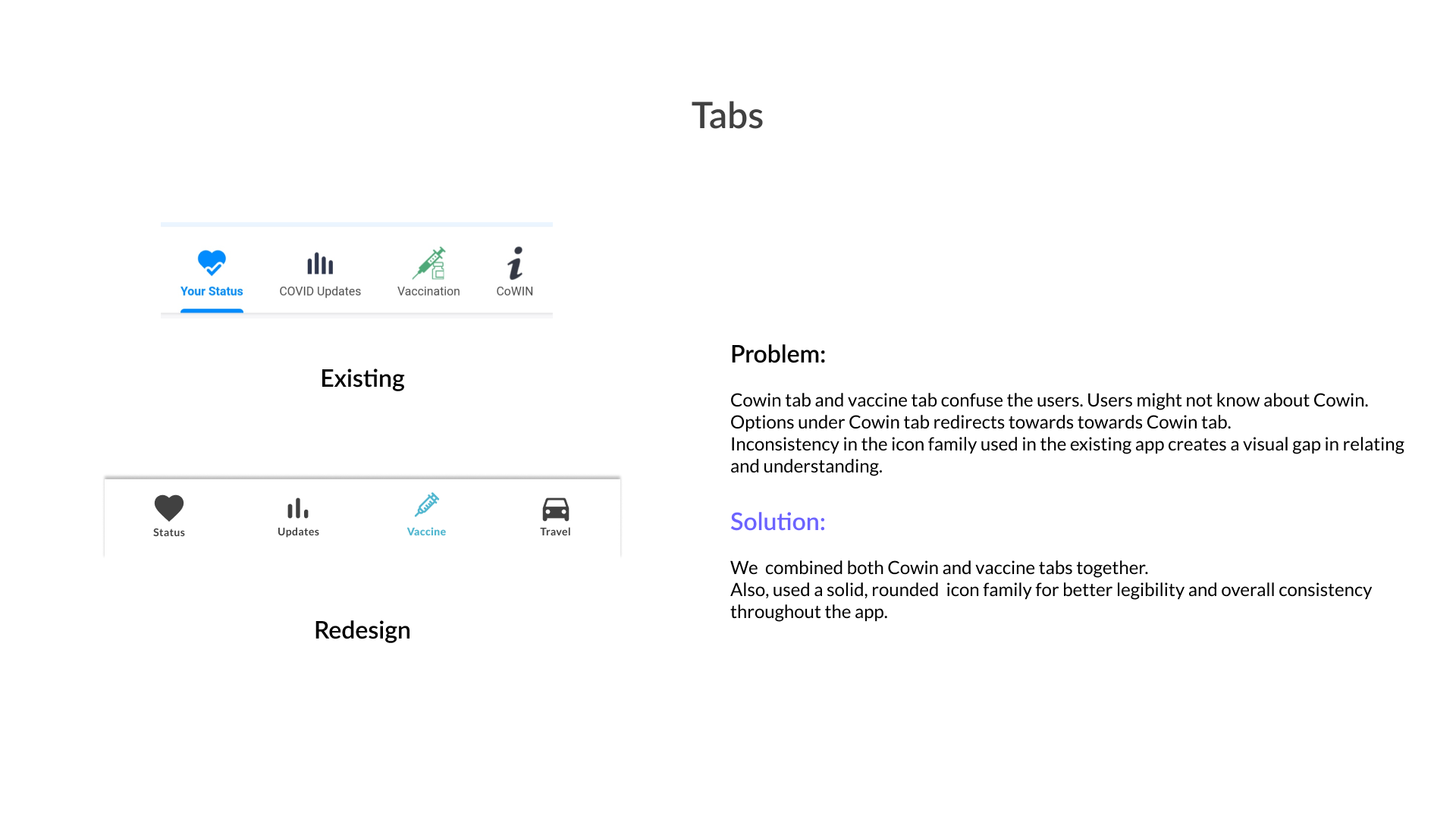
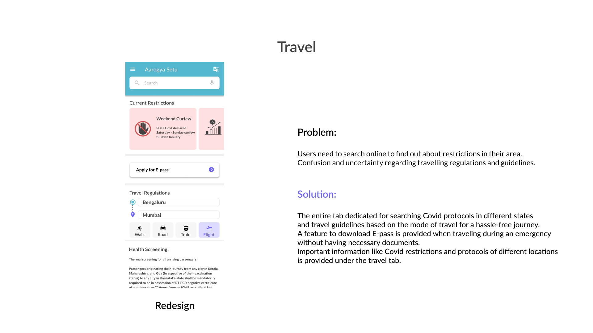
Following are the solutions proposed by my team:
REFLECTIONS
This was my first collaborative design project, and having visual designers on the team introduced new perspectives that enriched the overall creative process. I also developed key skills in conflict resolution, learning how to mediate differing ideas within the group to ensure alignment and maintain project momentum. The collaborative environment pushed me to think more holistically about design, not just from a functional perspective but also in terms of visual aesthetics and user experience.
As we move forward, the next steps include creating an interactive prototype that we can test with real users, performing multiple iterations based on feedback. Additionally, we plan to research alternative methods for contact tracing to ensure the solution is adaptable and effective across various scenarios. This process will allow us to refine the design while keeping both user needs and technological constraints in mind.


